
티스토리 뷰
GridItem 을 만들 때 GridItem.Size 를 세팅해야한다.
Size 옵션 중, 자주 헷갈리는 adaptive와 flexible 을 정리!
public enum Size {

    /// A single item with the specified fixed size.
    case fixed(CGFloat)

    /// A single flexible item.
    ///
    /// The size of this item is the size of the grid with spacing and
    /// inflexible items removed, divided by the number of flexible items,
    /// clamped to the provided bounds.
    case flexible(minimum: CGFloat = 10, maximum: CGFloat = .infinity)

    /// Multiple items in the space of a single flexible item.
    ///
    /// This size case places one or more items into the space assigned to
    /// a single `flexible` item, using the provided bounds and
    /// spacing to decide exactly how many items fit. This approach prefers
    /// to insert as many items of the `minimum` size as possible
    /// but lets them increase to the `maximum` size.
    case adaptive(minimum: CGFloat, maximum: CGFloat = .infinity)
}
✓ flexible
- A single flexible item.
✓ adaptive
- Multiple items in the space of a single flexible item.
- minimum 디폴트값이 없어서 꼭 세팅해야함.
직관적으로 이해가 가지 않는다.. 케이스별로 구분해보자!
Case 1. Item 사이즈가 고정. 디바이스 크기에 따라 grid 구성이 바뀔 수 있을 때
(예를들어 사이즈가 고정인 6개의 아이템이 있을 때, 디바이스에 따라 3x2일 수도 있고 1x6 일수도 있다는 스펙)
[ 결론 요약 ]
--> adaptive 를 쓴다. (column 수는 1로)
[ 과정 ]
1.1 adaptive (maximum 세팅 X. 즉 infinity)
struct ContentView: View {
    var body: some View {
        let item = GridItem(.adaptive(minimum: 100), spacing: 30)
        let columns = Array(repeating: item, count: 3)

        LazyVGrid(columns: columns, alignment: .leading, spacing: 30) {
            ForEach(0..<10) { i in
                Text("안녕 \(i)")
                    .frame(width: 100, height: 40)
                    .border(.white, width: 0.5)
            }
        }
        .background(Color.green)
    }
}


1.2 adaptive (maximum 세팅 0)
struct ContentView: View {
    var body: some View {
        let item = GridItem(.adaptive(minimum: 100, maximum: 100), spacing: 30)
        let columns = Array(repeating: item, count: 3)

        LazyVGrid(columns: columns, alignment: .leading, spacing: 30) {
            ForEach(0..<10) { i in
                Text("안녕 \(i)")
                    .frame(width: 100, height: 40)
                    .border(.white, width: 0.5)
            }
        }
        .background(Color.green)
    }
}

1.3 adaptive 결론
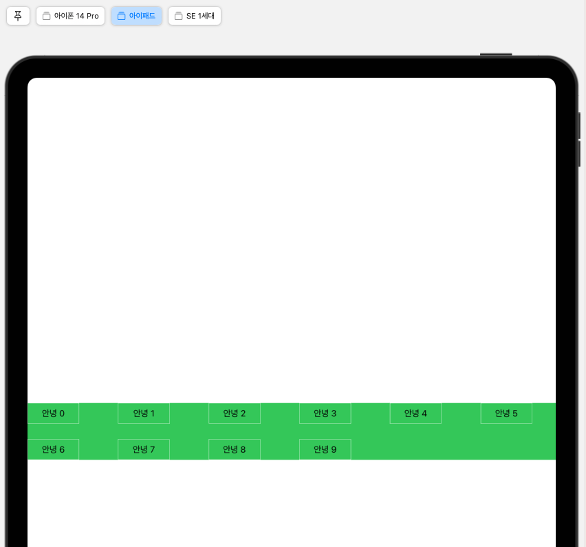
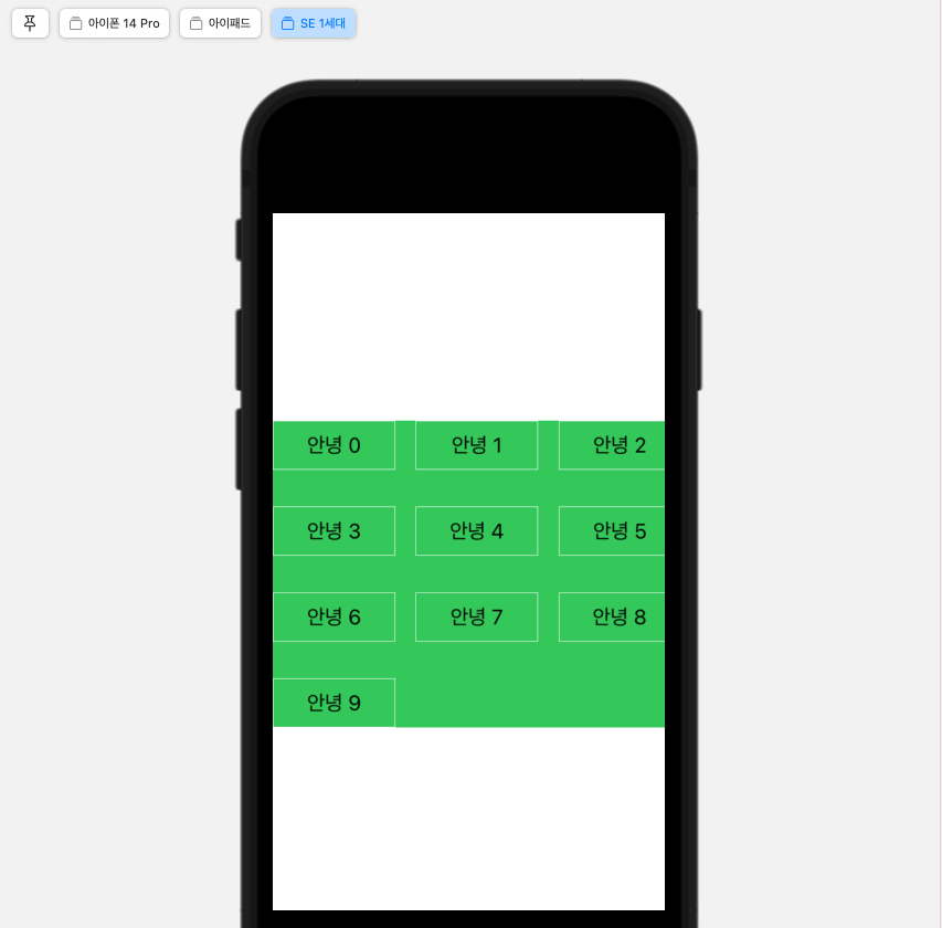
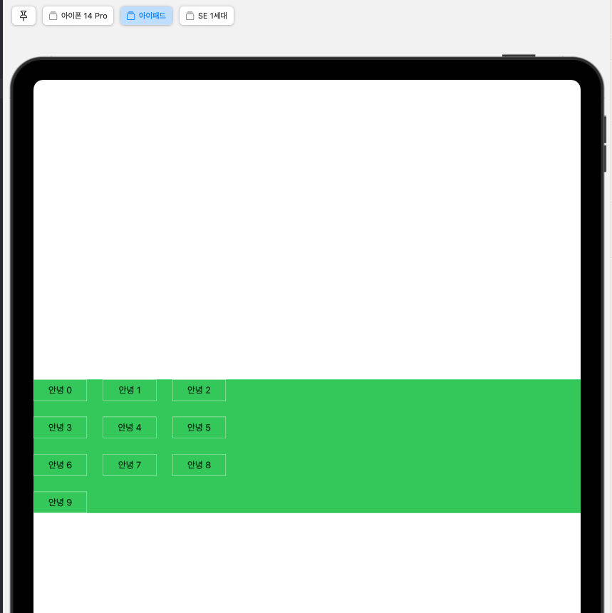
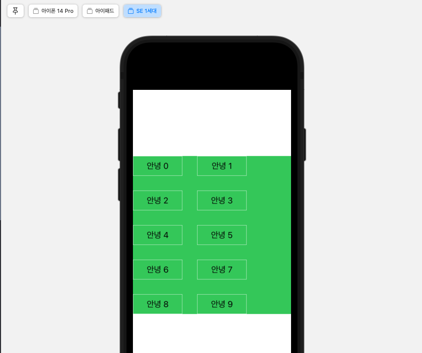
- column을 3으로 세팅해도 아이패드처럼 공간이 남는 경우, column 수가 유동적으로 늘어나는 것을 볼 수 있다.
- 하지만 SE 1세대처럼 공간이 부족한 경우는 column 수가 유지된다. (그래서 아이템이 겹치게 된다.)
- maximum을 설정하지 않으면 공간이 남을 때 설정해준 spacing 보다 더 큰 spacing이 세팅될 수 있다.
- 반면 공간이 부족할 때 spacing은 줄어들지 않는다.
2.1 flexible (maximum 세팅 X. 즉 infinity)
struct ContentView: View {
    var body: some View {
        let item = GridItem(.flexible(minimum: 100), spacing: 30)
        let columns = Array(repeating: item, count: 3)

        LazyVGrid(columns: columns, alignment: .leading, spacing: 30) {
            ForEach(0..<10) { i in
                Text("안녕 \(i)")
                    .frame(width: 100, height: 40)
                    .border(.white, width: 0.5)
            }
        }
        .background(Color.green)
    }
}

2.2 flexible (maximum 세팅 O)
struct ContentView: View {
    var body: some View {
        let item = GridItem(.flexible(minimum: 100, maximum: 100), spacing: 30)
        let columns = Array(repeating: item, count: 3)

        LazyVGrid(columns: columns, alignment: .leading, spacing: 30) {
            ForEach(0..<10) { i in
                Text("안녕 \(i)")
                    .frame(width: 100, height: 40)
                    .border(.white, width: 0.5)
            }
        }
        .background(Color.green)
    }
}


2.3 flexible 결론
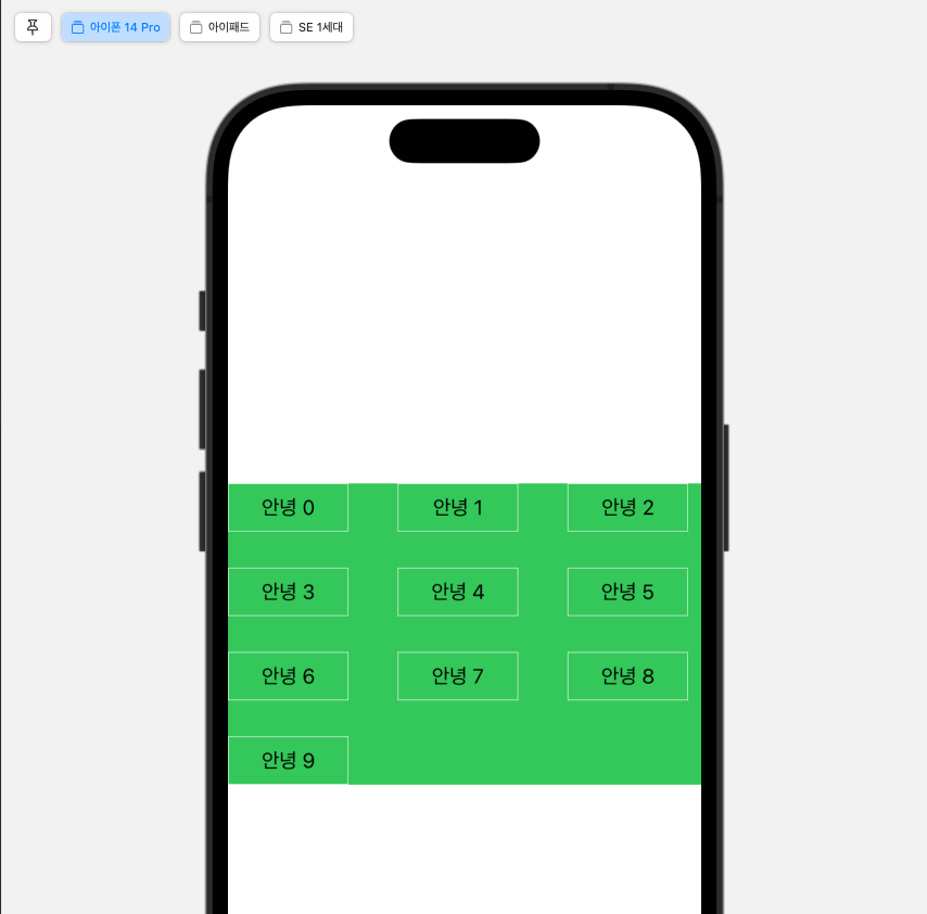
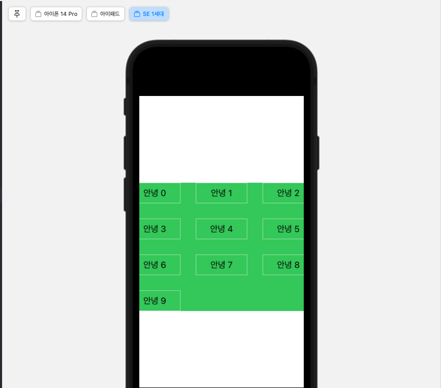
- adaptive와 달리, 무조건 설정한 column 갯수로만 나온다 (공간이 남든 적든 3 column 유지)
- adaptive와 동일하게, maximum을 설정해야지 세팅해준 spacing 대로 나온다.
[ 결론 ]
Item 사이즈가 고정. 디바이스 크기에 따라 grid 구성이 바뀔 수 있을 때
--> adaptive 쓴다. (column 수는 1로)
struct ContentView: View {
    var body: some View {
        let item = GridItem(.adaptive(minimum: 100, maximum: 100), spacing: 30)
        let columns = Array(repeating: item, count: 1)

        LazyVGrid(columns: columns, alignment: .leading, spacing: 30) {
            ForEach(0..<10) { i in
                Text("안녕 \(i)")
                    .frame(width: 100, height: 40)
                    .border(.white, width: 0.5)
            }
        }
        .background(Color.green)
    }
}


Case 2. Item 사이즈가 유동. 디바이스 크기에 따라 grid 구성이 바뀔 수 있을 때
아래와 같은 느낌.
UIKit에서는 보통 TagLayout (UICollectionViewFlowLayout 서브클래싱) 을 만들어서 쓰는,,

스유에서는 방법이 없는 것 같습니다.. ?
struct ContentView: View {
    var body: some View {
        // let item = GridItem(.flexible(minimum: 50), spacing: 30)
        let item = GridItem(.adaptive(minimum: .infinity), spacing: 30)
        let columns = Array(repeating: item, count: 1)

        LazyVGrid(columns: columns, alignment: .leading, spacing: 30) {
            ForEach(1..<10) { i in
                Text(String(repeating: "안녕", count: i))
                    .lineLimit(0)
                    .frame(height: 40)
                    .border(.white, width: 0.5)
            }
        }
        .background(Color.green)
    }
}
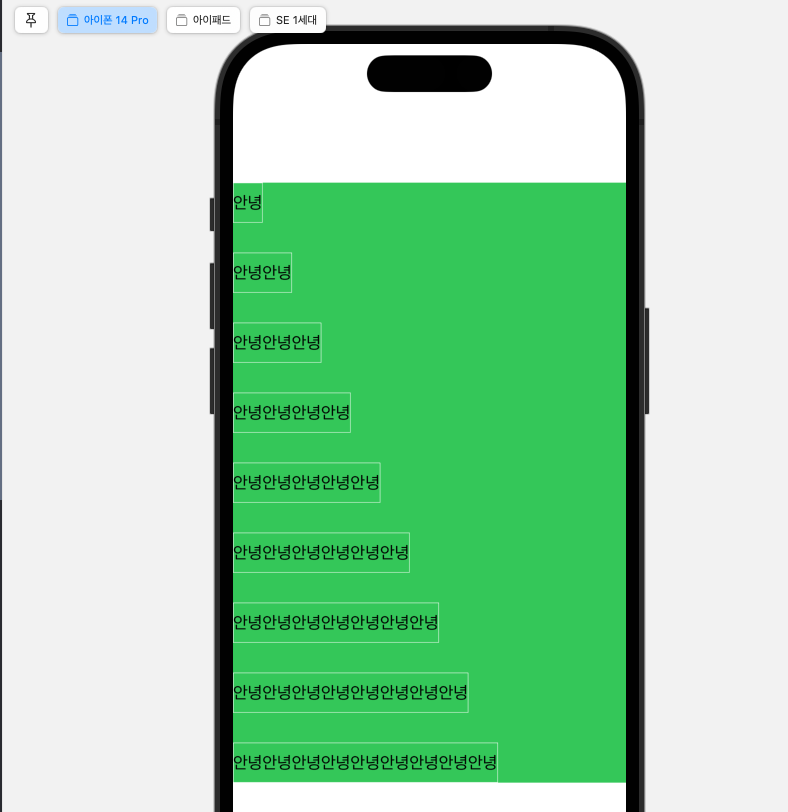
-> Layout 프로토콜을 채택해 별도의 Layout을 만들면 될 듯. (참고)
'🍏 > SwiftUI + Combine' 카테고리의 다른 글
| [SwiftUI] @Observable 매크로 (2) (0) | 2023.07.31 |
|---|---|
| [SwiftUI] @Observable 매크로 (1) (1) | 2023.07.31 |
| [SwiftUI] task modifier (0) | 2023.03.08 |
| [Combine] 네트워킹 (0) | 2023.01.13 |
| [SwiftUI] rotationEffect, scaleEffect (0) | 2023.01.06 |
- Total
- Today
- Yesterday
- 구글 Geocoding API
- ribs
- METAL
- Flutter Text Gradient
- Python Type Hint
- flutter dynamic link
- flutter 앱 출시
- Flutter getter setter
- flutter build mode
- 플러터 싱글톤
- Django Heroku Scheduler
- 플러터 얼럿
- Dart Factory
- ipad multitasking
- drf custom error
- cocoapod
- Watch App for iOS App vs Watch App
- 장고 URL querystring
- Django FCM
- Sketch 누끼
- Flutter Spacer
- Django Firebase Cloud Messaging
- 장고 Custom Management Command
- flutter deep link
- SerializerMethodField
- PencilKit
- Flutter 로딩
- Flutter Clipboard
- github actions
- DRF APIException
| 일 | 월 | 화 | 수 | 목 | 금 | 토 |
|---|---|---|---|---|---|---|
| 1 | 2 | 3 | ||||
| 4 | 5 | 6 | 7 | 8 | 9 | 10 |
| 11 | 12 | 13 | 14 | 15 | 16 | 17 |
| 18 | 19 | 20 | 21 | 22 | 23 | 24 |
| 25 | 26 | 27 | 28 | 29 | 30 | 31 |